This clear and concise visual tool helps senior managers weigh the most pressing perceptions
By Staci
I learned about the concept of message mapping while studying for my bachelor’s degree in public relations. A message map is a wonderful tool used to ensure that an organization is telling a succinct brand message. With a quick glance, you should be able to articulate your company’s playbook based on the flow of core messages and proof points.
Among its many uses, a message map is a great tool to use for media training. An overall message map detailing a macro view of your organization is great to have on hand for media training at all times, but narrowly focusing your message map to address a singular issue can do just the trick when trying to prepare a senior manager for an interview. An issue based message map helps build the bigger picture and makes it easier for the trainee to identify opportunities to bridge responses and get back on message.
But, developing an issue based message map requires a certain level of insight to make sure that you are delivering the right messages. This is where the idea of the sentiment map comes in.
Introducing the sentiment map
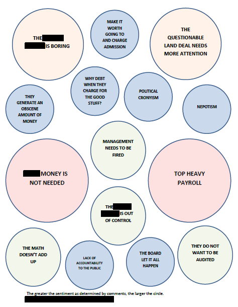
This is an example of a sentiment map. Similar perceptions are grouped together to illustrate the root cause of emerging misperceptions.
The concept of a sentiment map is essentially more like the prelude to a message map. Environmental scanning is an important function of public relations that often gets overlooked. When times get tough with the media (or a key public), it can be difficult to get senior managers to focus on the underlying sentiment and the key perceptions that are emerging from all of the noise. We all love our organizations, often causing our first reaction to be dismissive and defensive in the wake of negative news attention.
Developing a sentiment map can help you refocus the attentions of your senior managers to the REAL issues at hand. Let’s face it – perception IS reality. It may not be the reality of your organization, but it certainly is the reality of your key publics. Addressing those misperceptions is precisely where your work needs to be done.
You can develop your sentiment map from a macro perspective to stay proactive with your environmental scanning and keep it “alive” by updating it periodically to see the change in perceptions over time. You can slice and dice your map by key publics, media outlets or issues. Another way to use the sentiment map is to develop it around a single issue raised in the media, allowing your senior managers to have a snapshot of what is feeding the sentiment towards your organization at that particular time.
Creating a sentiment map is simple. The suggested steps below are specific to a singular-issue based map (similar to the one pictured above), but once you have worked through the exercise, you will see how you can adapt it to better work for your purposes.
Just follow these steps and your map will take shape:
1. Survey comments
When a negative story takes hold in the media, it is often perpetrated through several outlets. Make sure you are searching for any and all comments made in response to the media coverage. Do not dismiss comments, even if they are made by a regular adversary. Also, do not limit yourself to comments only made on news sites. Make sure you are entering into the social media abyss for any chatter surrounding your organization in relation to the issue.
2. Group like comments together
This step is completely subjective. You want to start grouping comments together based on the sentiment of the underlying message. Do not be overly aggressive when grouping comments. You want key insights to bubble up to the surface and be able to stand on their own.
3. Tally the perceptions
Once you have identified your emerging perceptions, start tallying the number of times those perceptions appear in the broad base of comments made around the issue.
4. Assign perceptions to a bubble size
This is an excellent time to develop a point system to help you determine where perceptions fall within the various bubble sizes. I like to stick with three to four bubble sizes depending on the depth and variety of perceptions. You can choose your point system based on the overall size of your comment pool and the number of perceptions that have emerged.
For example:
- If a perception appears one to five times, it is assigned to the smallest bubble.
- If a perception appears six to ten times, it is assigned to the second smallest bubble.
- If a perception appears eleven to fifteen times, it is assigned to the second largest bubble.
- If a perception appears 16+ times, it is assigned to the largest bubble.
5. Plot the bubbles
You are now at a point where you can begin to plot the bubbles, grouping related perceptions together in the same area. The larger picture will begin to take shape. This visual tool helps you see how the lesser held perceptions morph together to create a greater, overall sentiment about your organization.
Using the sentiment map allows you to focus your message to address the largely held misperceptions that are in play. While at the same time, you can work on flipping the smaller misperceptions with a more targeted approach. To take it a step further, take another look at your pool of comments and create a profile for each “person” that feeds into each individual perception. The possibilities that come from the sentiment map are endless. Take this tool and tweak it to work best for you.
In full disclosure, I am not aware of this idea being widely used. I was inspired by the concept of a message map and found the use of a sentiment map to be helpful in organizing our response around an issue that caught fire in the local media. It is safe to say that the results presented on the sentiment map surprised my senior leaders. They had attached a lot of importance (and emotions) to a few misperceptions, but what had actually emerged on the sentiment map was an emphasis on misperceptions that were not even in their field of vision pertaining to the issue. This ended up being a very important exercise for us. If this idea is widely used and there is a common name for it, please let us know in the comment section below!
Do you have a go-to-tool that you like to use to visually communicate information to your CEO?
